Chi-Square Population
Variance Test in Excel
for Marketing
It’s hard to predict exactly how much each one of your new customers will buy, but you probably have a good idea of the range that you would expect your customer’s spending to fall within.
What if you suddenly noticed a blip in recent customer order amounts which indicated that your customer spending spread might be widening? Is there a way know for sure whether the spending spread really has widened, or is this just a temporary aberration that grabbed your attention but may not mean anything?
In statistical terms, the question you would be asking is: Has the standard deviation of my customers’ order size increased? Good news --> There is a convenient statistical test you can quickly run in Excel to find that out. The test is called the Chi-Square Variance Test and is used to determine if the variance of a population has changed. Variance equals the standard deviation squared so if a population’s standard deviation increases, so does its variance, to an even greater degree.
The Chi-Square Variance Test is a great and simple way to determine whether your customers are more or less focused in their purchases of you products. More importantly, the Chi-Square Variance Test tells you whether your customers are being affected by something is changing what they buy from your company.
If variance of your customers’ spending has become smaller, your customer order size has become more predictable and more focused. If the variance has increased, your customer order size has become less predictable and less focused.
This Test Will Not Tell You What Changed, Only That Something Has Changed.
If the range (standard deviation) of customer spending on individual orders changes, the product mix that your customers normally purchase is changing. The underlying reason for this probably has important implications for the marketing program. If standard deviation (and therefore the variance) of order size changes, you will want to investigate further and find out why.
Here is a video that will demonstrate step-by-step how to perform the Chi-Square Variance Test in Excel to determine if the majority of your customers really have become more or less focused in their spending on individual orders.
Here is a Step-By-Step Video Showing How to Find Out If Your Customers Have Become More or Less Focused In Their Spending By Using the Chi-Square Variance Test in Excel:
(Is Your Sound Turned On?)
What Is the Chi-Square Variance Test?
The Chi-Square Variance Test and is used to determine if the variance of a population has changed. Marketers use the Chi-Square Variance Test to determine if the expected range of customer spending is changing. If so, something is affecting the buying habits of the customers.
The Chi-Square Variance Test consists of just 2 calculations that require only 4 inputs total.
These 4 inputs are:
1) Historic Standard Deviation, σ, of the population – This would be the long-time standard deviation of customer spending per order. It shouldn’t be too hard to calculate a standard deviation of past customer order size. Population Standard Deviation is usually denoted as σ, sigma.
2) Standard Deviation, s, of a recent large (at least 30) sample drawn randomly from the population. Make sure that the sample is random and is representative of the population from which the Population Standard Deviation was taken. Sample Standard Deviation is usually denoted as s.
3) The Sample Size, n.
4) The Degree of Certainty desired in the test. For example, you might want to be at least 95% certain of the outcome determined by the test.
The Chi-Square Variance Test requires measurements of standard deviation, not variance. That has no effect because, as mentioned above, variance is derived from standard deviation. Variance equals standard deviation squared.
The 5 Steps of the Chi-Square Variance Test
There are 5 steps in the Chi-Square Variance Test. They are;
Step 1) Determine the Required Level of Certainty, and, therefore, α, Alpha.
Step 2) Measure Sample Standard Deviation (s) from a large recent random sample drawn from the same population from which the Population Standard Deviation (σ) was derived. Sample size, n, must be at least 30.
Step 3) Calculate the Chi-Square Statistic.
Chi-Square Statistic = [ (n-1)*(s*s) ] / [σ*σ]
Step 4) Calculate the Curve Area Outside of the Chi-Square Statistic.
There are 2 possibilities:
a) If Sample Standard Deviation, s, is greater than the population Standard Deviation (σ):
Calculate the Area in the Right Outer Tail to the Right of the Chi-Square Statistic by this formula:
Tail Area Right of Chi-Square Statistic =
CHIDIST( Chi-Square Statistic, n-1 )
In this blog article and attached video, we will color the tail area outside the chi-Square Statistic with RED.
We will also color the area under the curve that represents alpha with yellow, as follows:
The 5% Alpha Area (Yellow) Resulting
From 95% Required Certainty

From 95% Required Certainty

Click on the Image To See a Larger Version
The Red Area Outside the Chi-Square Statistic
(Is Smaller Than the Yellow Alpha Area)
(Is Smaller Than the Yellow Alpha Area)

Click on the Image To See a Larger Version
b) If Sample Standard Deviation, s, is less than the population Standard Deviation, σ,
then: Calculate the Area in the Left Outer Tail to the Left of the Chi-Square Statistic Tail:
Tail Area Left of Chi-Square Statistic =
1 - CHIDIST( Chi Square Statistic, n-1 )
The 5% Alpha Area (Yellow) Resulting
From the 95% Required Certainty

Click on the Image To See a Larger Version
The Red Area Outside the Chi-Square Statistic
(Is Larger Than the Yellow Alpha Area)
(Is Larger Than the Yellow Alpha Area)

Click on the Image To See a Larger Version
The area under the Chi-Square curve that lies outside of the Chi-Square Statistic is sometimes called the P Value. For example, if 3% of the curve area lies outside the Chi-Square Statistic, then the P Value is 0.03.
Step 5) Analyze Using the Chi-Square Statistic Rule: If the area under the curve outside the Chi-Square Statistic is less than alpha, the population variance has moved in the direction of Sample Standard Deviation.
For example, if alpha is 0.05 (you require 95% certainty and alpha is therefore 0.05) and only 3% of the area under the Chi-Square curve lies outside of the Chi-Square Statistic, then you can now state with 95% certainty that the variance had moved.
The variance would have moved in the direction of the Sample Standard Deviation. If Sample Standard Deviation was measured to be greater the Population Standard Deviation and the curve area outside of the Chi-Square Statistic (3% = 0.03) was less than alpha (0.05), you can state with 95% certainty that population variance has increased.
To sum it up with charts:
If the red area fits inside the yellow area, we can state with the required degree of certainty that the population variance has moved in the direction of the sample standard deviation. In the case directly below, the red area does fit inside the yellow (alpha) area so we can state that the population varianced moved to the right (increased), with 95% certainty:
The Red Area Outside the Chi-Square Statistic
Is Smaller Than the Yellow Alpha Area
Click on the Image To See a Larger Version
If the red area DOES NOT fit inside the yellow area, we CANNOT state with the required degree of certainty that the population variance has moved in the direction of the sample standard deviation. In the case directly below, the red area DOES NOT fit inside the yellow (alpha) area so we CANNOT state that the population varianced moved to the left (decreased), with 95% certainty:
The Red Area Outside the Chi-Square Statistic
Is Larger Than the Yellow Alpha Area
Click on the Image To See a Larger Version
Here is the Test We Ran
Here is the problem definition: Customers on a commercial web site have historically had a standard deviation of 1.6 in the number of items they buy on individual purchase orders. The company’s Internet marketing manager took a random sample of 50 recent orders and measured the standard deviation of that sample to be 1.9 items per order.
The Internet marketing manager wanted to know with at least 95% certainty whether the population standard deviation had increased (had moved in the direction of the sample standard deviation).
The Required 4 Pieces of Information
1) Population Standard Deviation, σ, of item per order = 1.6
2) Sample Standard Deviation, s, of items per order = 1.9
3) Sample size, n = 50
4) Required Level of Certainty = 95%
2) Sample Standard Deviation, s, of items per order = 1.9
3) Sample size, n = 50
4) Required Level of Certainty = 95%
The 5 Steps of the Chi-Square Variance Test
Using the 5-Step Chi-Square Variance Process, the Internet Marketing Manager determines within 95% certainty whether the population variance has increased as follows.
Step 1) Determine the Required Level of Certainty, and, therefore α, Alpha.
The Required Level of Certainty is 95%. Alpha, α, is 0.05.
Alpha = 1 – Required Level of Certainty = 1 – 95% = 0.05
Step 2) Measure Sample Standard Deviation (s) from a recent, large, representative random sample drawn from the same population from which the Population Standard Deviation (σ) was derived.Sample Standard Deviation, s, of items per order = 1.6. Population Standard Deviation, σ, of item per order = 1.6
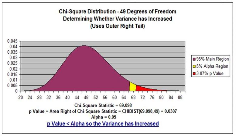
Step 3) Calculate the Chi-Square StatisticChi-Square Statistic = [ (n-1)*(s*s) ] / [σ*σ]Chi-Square Statistic = [ (50 - 1) * (1.9 * 1.9) ] / [1.6 * 1.6] = 69.09766
Step 4) Calculate the Curve Area Outside of the Chi-Square Statistic
If Sample Standard Deviation, s, is greater than the population Standard Deviation (σ):
then calculate the Area in the Right Outer Tail outside of the Chi-Square Statistic by this formula:
then calculate the Area in the Right Outer Tail outside of the Chi-Square Statistic by this formula:
Tail Area Right of Chi-Square Statistic =
CHIDIST( Chi-Square Statistic, n-1 )
Since s is greater than σ,
Tail Area Right of Chi-Square Statistic =
CHIDIST( Chi-Square Statistic, n-1 )
Tail Area Right of Chi-Square Statistic =
CHIDIST( Chi-Square Statistic, n-1 )
Tail Area Right of Chi-Square Statistic =
CHIDIST( 69.09766, 49 ) = 3.07
So area under the curve outside the Chi-Square Statistic = 3.07%
The P Value = 0.0307
The Red Area Outside the Chi-Square Statistic
(Is Smaller Than Alpha) in the Outer Right Tail
So We Can State With 95% Certainty That
the Population Variance Have Moved to the
Right (Increased)
(Is Smaller Than Alpha) in the Outer Right Tail
So We Can State With 95% Certainty That
the Population Variance Have Moved to the
Right (Increased)
Click on the Image To See a Larger Version
Step 5) Analyze Using the Chi-Square Statistic Rule: If the P Value (P Value = 0.0307), the area under the curve outside the Chi-Square Statistic, is less than α (α = 0.05), the population variance has moved in the direction of Sample Standard Deviation.
We can see that the red area fits inside of the yellow area on the outer right tail. In this case, the area outside the Chi-Statistic (3.07%) is less than Alpha (5%), we can state with 95% certainty that the population variance has increased.
Now the Internet marketing manager needs to determine the underlying reason why customer spending has become less focused.
Conclusion - The Chi-Square Variance Test Tells Whether Something Has Changed Your Customers' Buying Habits
Incidentally, all of the Chi-Square Probability Density Function graphs in this article had 49 Degrees of Freedom. Degrees of Freedom is derived from sample size and equals n-1 (50 - 1 = 49 Degrees of Freedom).
Here are links to other training videos of how to create interactive graphs in Excel of some of the other major statistical distributions:
How to Graph the Normal Distribution's Probability Density Function in Excel
How To Graph the Normal Distribution's Cumulative Distribution Function in Excel
How To Graph the Students t Distributions' Probability Density Function in Excel
How To Graph the Chi-Square Distribution's Probability Density Function in Excel
How To Graph the Weibull Distribution's PDF and CDF - in Excel

If you have any questions or comments about this article and attached videos, please post them below. Your opinion is highly valued
Excel Master Series Blog Directory
Statistical Topics and Articles In Each Topic
- Histograms in Excel
- Bar Chart in Excel
- Combinations & Permutations in Excel
- Normal Distribution in Excel
- Overview of the Normal Distribution
- Normal Distribution’s PDF (Probability Density Function) in Excel 2010 and Excel 2013
- Normal Distribution’s CDF (Cumulative Distribution Function) in Excel 2010 and Excel 2013
- Solving Normal Distribution Problems in Excel 2010 and Excel 2013
- Overview of the Standard Normal Distribution in Excel 2010 and Excel 2013
- An Important Difference Between the t and Normal Distribution Graphs
- The Empirical Rule and Chebyshev’s Theorem in Excel – Calculating How Much Data Is a Certain Distance From the Mean
- Demonstrating the Central Limit Theorem In Excel 2010 and Excel 2013 In An Easy-To-Understand Way
- t-Distribution in Excel
- Binomial Distribution in Excel
- z-Tests in Excel
- t-Tests in Excel
- Overview of t-Tests: Hypothesis Tests that Use the t-Distribution
- 1-Sample t-Tests in Excel
- Overview of the 1-Sample t-Test in Excel 2010 and Excel 2013
- Excel Normality Testing For the 1-Sample t-Test in Excel 2010 and Excel 2013
- 1-Sample t-Test – Effect Size in Excel 2010 and Excel 2013
- 1-Sample t-Test Power With G*Power Utility
- Wilcoxon Signed-Rank Test As a 1-Sample t-Test Alternative in Excel 2010 and Excel 2013
- Sign Test As a 1-Sample t-Test Alternative in Excel 2010 and Excel 2013
- 2-Independent-Sample Pooled t-Tests in Excel
- Overview of 2-Independent-Sample Pooled t-Test in Excel 2010 and Excel 2013
- Excel Variance Tests: Levene’s, Brown-Forsythe, and F Test For 2-Sample Pooled t-Test in Excel 2010 and Excel 2013
- Excel Normality Tests Kolmogorov-Smirnov, Anderson-Darling, and Shapiro Wilk Tests For Two-Sample Pooled t-Test
- Two-Independent-Sample Pooled t-Test - All Excel Calculations
- 2-Sample Pooled t-Test – Effect Size in Excel 2010 and Excel 2013
- 2-Sample Pooled t-Test Power With G*Power Utility
- Mann-Whitney U Test in Excel as 2-Sample Pooled t-Test Nonparametric Alternative in Excel 2010 and Excel 2013
- 2-Sample Pooled t-Test = Single-Factor ANOVA With 2 Sample Groups
- 2-Independent-Sample Unpooled t-Tests in Excel
- 2-Independent-Sample Unpooled t-Test in Excel 2010 and Excel 2013
- Variance Tests: Levene’s Test, Brown-Forsythe Test, and F-Test in Excel For 2-Sample Unpooled t-Test
- Excel Normality Tests Kolmogorov-Smirnov, Anderson-Darling, and Shapiro-Wilk For 2-Sample Unpooled t-Test
- 2-Sample Unpooled t-Test Excel Calculations, Formulas, and Tools
- Effect Size for a 2-Independent-Sample Unpooled t-Test in Excel 2010 and Excel 2013
- Test Power of a 2-Independent Sample Unpooled t-Test With G-Power Utility
- Paired (2-Sample Dependent) t-Tests in Excel
- Paired t-Test in Excel 2010 and Excel 2013
- Excel Normality Testing of Paired t-Test Data
- Paired t-Test Excel Calculations, Formulas, and Tools
- Paired t-Test – Effect Size in Excel 2010, and Excel 2013
- Paired t-Test – Test Power With G-Power Utility
- Wilcoxon Signed-Rank Test As a Paired t-Test Alternative
- Sign Test in Excel As A Paired t-Test Alternative
- Hypothesis Tests of Proportion in Excel
- Hypothesis Tests of Proportion Overview (Hypothesis Testing On Binomial Data)
- 1-Sample Hypothesis Test of Proportion in Excel 2010 and Excel 2013
- 2-Sample Pooled Hypothesis Test of Proportion in Excel 2010 and Excel 2013
- How To Build a Much More Useful Split-Tester in Excel Than Google's Website Optimizer
- Chi-Square Independence Tests in Excel
- Chi-Square Goodness-Of-Fit Tests in Excel
- F Tests in Excel
- Correlation in Excel
- Pearson Correlation in Excel
- Spearman Correlation in Excel
- Confidence Intervals in Excel
- Overview of z-Based Confidence Intervals of a Population Mean in Excel 2010 and Excel 2013
- t-Based Confidence Intervals of a Population Mean in Excel 2010 and Excel 2013
- Minimum Sample Size to Limit the Size of a Confidence interval of a Population Mean
- Confidence Interval of Population Proportion in Excel 2010 and Excel 2013
- Min Sample Size of Confidence Interval of Proportion in Excel 2010 and Excel 2013
- Simple Linear Regression in Excel
- Overview of Simple Linear Regression in Excel 2010 and Excel 2013
- Simple Linear Regression Example in Excel 2010 and Excel 2013
- Residual Evaluation For Simple Regression in Excel 2010 and Excel 2013
- Residual Normality Tests in Excel – Kolmogorov-Smirnov Test, Anderson-Darling Test, and Shapiro-Wilk Test For Simple Linear Regression
- Evaluation of Simple Regression Output For Excel 2010 and Excel 2013
- All Calculations Performed By the Simple Regression Data Analysis Tool in Excel 2010 and Excel 2013
- Prediction Interval of Simple Regression in Excel 2010 and Excel 2013
- Multiple Linear Regression in Excel
- Basics of Multiple Regression in Excel 2010 and Excel 2013
- Multiple Linear Regression Example in Excel 2010 and Excel 2013
- Multiple Linear Regression’s Required Residual Assumptions
- Normality Testing of Residuals in Excel 2010 and Excel 2013
- Evaluating the Excel Output of Multiple Regression
- Estimating the Prediction Interval of Multiple Regression in Excel
- Regression - How To Do Conjoint Analysis Using Dummy Variable Regression in Excel
- Logistic Regression in Excel
- Logistic Regression Overview
- Logistic Regression Performed in Excel 2010 and Excel 2013
- R Square For Logistic Regression Overview
- Excel R Square Tests: Nagelkerke, Cox and Snell, and Log-Linear Ratio in Excel 2010 and Excel 2013
- Likelihood Ratio Is Better Than Wald Statistic To Determine if the Variable Coefficients Are Significant For Excel 2010 and Excel 2013
- Excel Classification Table: Logistic Regression’s Percentage Correct of Predicted Results in Excel 2010 and Excel 2013
- Hosmer-Lemeshow Test in Excel – Logistic Regression Goodness-of-Fit Test in Excel 2010 and Excel 2013
- Single-Factor ANOVA in Excel
- Overview of Single-Factor ANOVA
- Single-Factor ANOVA Example in Excel 2010 and Excel 2013
- Shapiro-Wilk Normality Test in Excel For Each Single-Factor ANOVA Sample Group
- Kruskal-Wallis Test Alternative For Single Factor ANOVA in Excel 2010 and Excel 2013
- Levene’s and Brown-Forsythe Tests in Excel For Single-Factor ANOVA Sample Group Variance Comparison
- Single-Factor ANOVA - All Excel Calculations
- Overview of Post-Hoc Testing For Single-Factor ANOVA
- Tukey-Kramer Post-Hoc Test in Excel For Single-Factor ANOVA
- Games-Howell Post-Hoc Test in Excel For Single-Factor ANOVA
- Overview of Effect Size For Single-Factor ANOVA
- ANOVA Effect Size Calculation Eta Squared (?2) in Excel 2010 and Excel 2013
- ANOVA Effect Size Calculation Psi (?) – RMSSE – in Excel 2010 and Excel 2013
- ANOVA Effect Size Calculation Omega Squared (?2) in Excel 2010 and Excel 2013
- Power of Single-Factor ANOVA Test Using Free Utility G*Power
- Welch’s ANOVA Test in Excel Substitute For Single-Factor ANOVA When Sample Variances Are Not Similar
- Brown-Forsythe F-Test in Excel Substitute For Single-Factor ANOVA When Sample Variances Are Not Similar
- Two-Factor ANOVA With Replication in Excel
- Two-Factor ANOVA With Replication in Excel 2010 and Excel 2013
- Variance Tests: Levene’s and Brown-Forsythe For 2-Factor ANOVA in Excel 2010 and Excel 2013
- Shapiro-Wilk Normality Test in Excel For 2-Factor ANOVA With Replication
- 2-Factor ANOVA With Replication Effect Size in Excel 2010 and Excel 2013
- Excel Post Hoc Tukey’s HSD Test For 2-Factor ANOVA With Replication
- 2-Factor ANOVA With Replication – Test Power With G-Power Utility
- Scheirer-Ray-Hare Test Alternative For 2-Factor ANOVA With Replication
- Two-Factor ANOVA Without Replication in Excel
- Creating Interactive Graphs of Statistical Distributions in Excel
- Interactive Statistical Distribution Graph in Excel 2010 and Excel 2013
- Interactive Graph of the Normal Distribution in Excel 2010 and Excel 2013
- Interactive Graph of the Chi-Square Distribution in Excel 2010 and Excel 2013
- Interactive Graph of the t-Distribution in Excel 2010 and Excel 2013
- Interactive Graph of the Binomial Distribution in Excel 2010 and Excel 2013
- Interactive Graph of the Exponential Distribution in Excel 2010 and Excel 2013
- Interactive Graph of the Beta Distribution in Excel 2010 and Excel 2013
- Interactive Graph of the Gamma Distribution in Excel 2010 and Excel 2013
- Interactive Graph of the Poisson Distribution in Excel 2010 and Excel 2013
- Solving Problems With Other Distributions in Excel
- Solving Uniform Distribution Problems in Excel 2010 and Excel 2013
- Solving Multinomial Distribution Problems in Excel 2010 and Excel 2013
- Solving Exponential Distribution Problems in Excel 2010 and Excel 2013
- Solving Beta Distribution Problems in Excel 2010 and Excel 2013
- Solving Gamma Distribution Problems in Excel 2010 and Excel 2013
- Solving Poisson Distribution Problems in Excel 2010 and Excel 2013
- Optimization With Excel Solver
- Maximizing Lead Generation With Excel Solver
- Minimizing Cutting Stock Waste With Excel Solver
- Optimal Investment Selection With Excel Solver
- Minimizing the Total Cost of Shipping From Multiple Points To Multiple Points With Excel Solver
- Knapsack Loading Problem in Excel Solver – Optimizing the Loading of a Limited Compartment
- Optimizing a Bond Portfolio With Excel Solver
- Travelling Salesman Problem in Excel Solver – Finding the Shortest Path To Reach All Customers
- Chi-Square Population Variance Test in Excel
- Analyzing Data With Pivot Tables
- SEO Functions in Excel
- Time Series Analysis in Excel