Regression Analysis
Done in Excel
2 Most Important Steps
Running a Regression in Excel is fairly easy. So is running one incorrectly. There are two crucial steps that should always be performed on the data before any Regression should be run. Fortunately these two steps are very quick and easy to do in Excel. They are:
1) Graph the Data
2) Run Correlation Analysis On All Variables
Here is a video of this article showing how to perform all four steps to Regression in Excel, including the above two crucial steps at the beginning:
Step-By-Step Video Showing How To Do All 4 Steps of Regression in Excel, Including the 2 Crucial Initial Steps That No One Does, But Should
(Is Your Sound Turned On?)
Why You Need To Run The 2 Crucial Steps Before Doing Regression
Here’s why you need to run the two crucial steps prior to regressing any data in Excel:
Crucial Step 1) Graphing the Data
Whether or not you are using Excel to run a Regression, you should always graph the data before doing anything else. Eyeballing the data will allow you to quickly determine whether there is any relationship between the independent (input) variables and the dependent (output) variable. You also want to evaluate whether the graph generally appears to be linear or possibly quadratic. Excel’s Regression Tool works well only for reasonably linear data. Eyeballing the data upfront will tell you very quickly whether Excel’s Linear Regression is the right tool for the job.
Graphing The Data To Check If It Is Linear

Click On Image To See Enlarged View
The input and output variables will be graphed together. The y-axis of the chart will provide the scale for plotting of those values. The x-axis will provide a measure of whatever continuum was used, e.g. time, to collect the values of all of the variables. Excel’s charting function is the way to go here. The above linked video shows exactly how to chart all the data in Excel.
Crucial Step 2) Running Correlation Analysis on All Variables Simultaneously
There are two good reasons for doing this. First, we want to remove any input variables which are clearly not good predictors of the output variable. Second, we want to make sure that none of the input variables have a high correlation with (are good predictors of) other input variables.
Running Correlation Analysis on the Data To Prevent Collinearity and also To Remove Input Variables That Have Low Correlation With the Output Variable

Click On Image To See Enlarged View
Correlation of multiple variables is easily done in Excel using the Correlation Data Analysis tool. The linked video shows exactly how to do that.
Remove Input Variables That Have Low Correlation With Output Variable
After you have run Correlation Analysis on the data, you will want to remove any input variables that have a low correlation with the output variable. A Correlation Coefficient of with an absolute value of less than 0.4 (between -0.4 and +0.4) between the output variable and an input variable indicates that the input variable is not a good predictor of the output. That input variable should be removed from the Regression Analysis. The attached video provides an example of this.
Data Columns Before Removing Input Variable With Low Correlation To Output

Click On Image To See Enlarged View
Data Columns After Removing Input Variables With Low Correlation To Output

Click On Image To See Enlarged View
Remove Inputs Variables Highly Correlated With Other Input Variables
After looking at the Correlation Coefficients between the input and output variables, look at the Correlation Coefficients between the input variables themselves. You do not want to use pairs of input variables that are good predictors of each other in a Regression. This will cause a Regression error known as Collinearity or Multicollinearity. One variable from any pair of highly-correlated input variables should be removed prior to running the Regression Analysis. Variables can be considered highly-Correlated if the absolute value of their Correlation Coefficient is greater the 0.7 (greater than +0.7 or less than -0.7).
Adding New Input Variables To The Regression Analysis
Here are a few hints about adding new input variables to a Regression Analysis. First, build up a Regression by starting with a small number of input variables and add any new ones one at a time. Second, good new input variables noticeably increase Adjusted R Square and also lower Standard Error without significantly changing the existing Regression Coefficients.
When you are satisfied with the output of the data graph and the Correlation Analysis, go ahead and run the Regression with Excel. An example of how to do this is shown in the above video.
The Excel Regression Dialogue Box

Click On Image To See Enlarged View
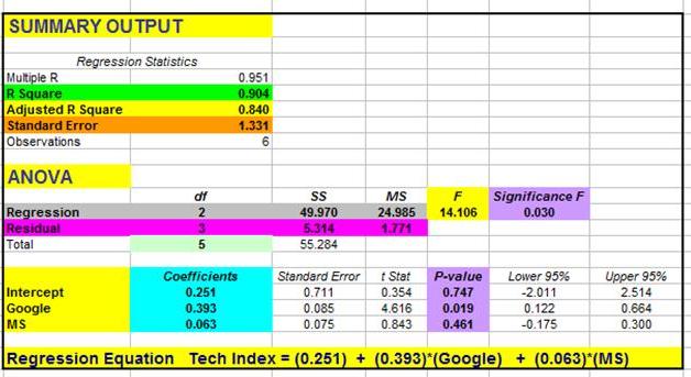
The final step of Excel Regression is Analysis of the Excel output. Here is a link to another video which shows you how to quickly read the most important parts of the Excel Regression output: http://bit.ly/Quickly-Understanding-Excel-Regression-Output
Excel Regression Output With Color Coding Added

Click On Image To See Enlarged View
Conclusion - Plotting the Data and Running Correlation Can Be BIG Time Savers
Plotting the data and running Correlation Analysis prior to running a Regression can save you lots of time that you might otherwise have to spend making adjustments to your Regression after running it.

If you have any comments about this article, feel free to post them right here. Your input and opinions are highly valued!
If You Like This, Then Share It...
Excel Master Series Blog Directory
Statistical Topics and Articles In Each Topic
- Histograms in Excel
- Bar Chart in Excel
- Combinations & Permutations in Excel
- Normal Distribution in Excel
- Overview of the Normal Distribution
- Normal Distribution’s PDF (Probability Density Function) in Excel 2010 and Excel 2013
- Normal Distribution’s CDF (Cumulative Distribution Function) in Excel 2010 and Excel 2013
- Solving Normal Distribution Problems in Excel 2010 and Excel 2013
- Overview of the Standard Normal Distribution in Excel 2010 and Excel 2013
- An Important Difference Between the t and Normal Distribution Graphs
- The Empirical Rule and Chebyshev’s Theorem in Excel – Calculating How Much Data Is a Certain Distance From the Mean
- Demonstrating the Central Limit Theorem In Excel 2010 and Excel 2013 In An Easy-To-Understand Way
- t-Distribution in Excel
- Binomial Distribution in Excel
- z-Tests in Excel
- t-Tests in Excel
- Overview of t-Tests: Hypothesis Tests that Use the t-Distribution
- 1-Sample t-Tests in Excel
- Overview of the 1-Sample t-Test in Excel 2010 and Excel 2013
- Excel Normality Testing For the 1-Sample t-Test in Excel 2010 and Excel 2013
- 1-Sample t-Test – Effect Size in Excel 2010 and Excel 2013
- 1-Sample t-Test Power With G*Power Utility
- Wilcoxon Signed-Rank Test As a 1-Sample t-Test Alternative in Excel 2010 and Excel 2013
- Sign Test As a 1-Sample t-Test Alternative in Excel 2010 and Excel 2013
- 2-Independent-Sample Pooled t-Tests in Excel
- Overview of 2-Independent-Sample Pooled t-Test in Excel 2010 and Excel 2013
- Excel Variance Tests: Levene’s, Brown-Forsythe, and F Test For 2-Sample Pooled t-Test in Excel 2010 and Excel 2013
- Excel Normality Tests Kolmogorov-Smirnov, Anderson-Darling, and Shapiro Wilk Tests For Two-Sample Pooled t-Test
- Two-Independent-Sample Pooled t-Test - All Excel Calculations
- 2-Sample Pooled t-Test – Effect Size in Excel 2010 and Excel 2013
- 2-Sample Pooled t-Test Power With G*Power Utility
- Mann-Whitney U Test in Excel as 2-Sample Pooled t-Test Nonparametric Alternative in Excel 2010 and Excel 2013
- 2-Sample Pooled t-Test = Single-Factor ANOVA With 2 Sample Groups
- 2-Independent-Sample Unpooled t-Tests in Excel
- 2-Independent-Sample Unpooled t-Test in Excel 2010 and Excel 2013
- Variance Tests: Levene’s Test, Brown-Forsythe Test, and F-Test in Excel For 2-Sample Unpooled t-Test
- Excel Normality Tests Kolmogorov-Smirnov, Anderson-Darling, and Shapiro-Wilk For 2-Sample Unpooled t-Test
- 2-Sample Unpooled t-Test Excel Calculations, Formulas, and Tools
- Effect Size for a 2-Independent-Sample Unpooled t-Test in Excel 2010 and Excel 2013
- Test Power of a 2-Independent Sample Unpooled t-Test With G-Power Utility
- Paired (2-Sample Dependent) t-Tests in Excel
- Paired t-Test in Excel 2010 and Excel 2013
- Excel Normality Testing of Paired t-Test Data
- Paired t-Test Excel Calculations, Formulas, and Tools
- Paired t-Test – Effect Size in Excel 2010, and Excel 2013
- Paired t-Test – Test Power With G-Power Utility
- Wilcoxon Signed-Rank Test As a Paired t-Test Alternative
- Sign Test in Excel As A Paired t-Test Alternative
- Hypothesis Tests of Proportion in Excel
- Hypothesis Tests of Proportion Overview (Hypothesis Testing On Binomial Data)
- 1-Sample Hypothesis Test of Proportion in Excel 2010 and Excel 2013
- 2-Sample Pooled Hypothesis Test of Proportion in Excel 2010 and Excel 2013
- How To Build a Much More Useful Split-Tester in Excel Than Google's Website Optimizer
- Chi-Square Independence Tests in Excel
- Chi-Square Goodness-Of-Fit Tests in Excel
- F Tests in Excel
- Correlation in Excel
- Pearson Correlation in Excel
- Spearman Correlation in Excel
- Confidence Intervals in Excel
- Overview of z-Based Confidence Intervals of a Population Mean in Excel 2010 and Excel 2013
- t-Based Confidence Intervals of a Population Mean in Excel 2010 and Excel 2013
- Minimum Sample Size to Limit the Size of a Confidence interval of a Population Mean
- Confidence Interval of Population Proportion in Excel 2010 and Excel 2013
- Min Sample Size of Confidence Interval of Proportion in Excel 2010 and Excel 2013
- Simple Linear Regression in Excel
- Overview of Simple Linear Regression in Excel 2010 and Excel 2013
- Simple Linear Regression Example in Excel 2010 and Excel 2013
- Residual Evaluation For Simple Regression in Excel 2010 and Excel 2013
- Residual Normality Tests in Excel – Kolmogorov-Smirnov Test, Anderson-Darling Test, and Shapiro-Wilk Test For Simple Linear Regression
- Evaluation of Simple Regression Output For Excel 2010 and Excel 2013
- All Calculations Performed By the Simple Regression Data Analysis Tool in Excel 2010 and Excel 2013
- Prediction Interval of Simple Regression in Excel 2010 and Excel 2013
- Multiple Linear Regression in Excel
- Basics of Multiple Regression in Excel 2010 and Excel 2013
- Multiple Linear Regression Example in Excel 2010 and Excel 2013
- Multiple Linear Regression’s Required Residual Assumptions
- Normality Testing of Residuals in Excel 2010 and Excel 2013
- Evaluating the Excel Output of Multiple Regression
- Estimating the Prediction Interval of Multiple Regression in Excel
- Regression - How To Do Conjoint Analysis Using Dummy Variable Regression in Excel
- Logistic Regression in Excel
- Logistic Regression Overview
- Logistic Regression Performed in Excel 2010 and Excel 2013
- R Square For Logistic Regression Overview
- Excel R Square Tests: Nagelkerke, Cox and Snell, and Log-Linear Ratio in Excel 2010 and Excel 2013
- Likelihood Ratio Is Better Than Wald Statistic To Determine if the Variable Coefficients Are Significant For Excel 2010 and Excel 2013
- Excel Classification Table: Logistic Regression’s Percentage Correct of Predicted Results in Excel 2010 and Excel 2013
- Hosmer-Lemeshow Test in Excel – Logistic Regression Goodness-of-Fit Test in Excel 2010 and Excel 2013
- Single-Factor ANOVA in Excel
- Overview of Single-Factor ANOVA
- Single-Factor ANOVA Example in Excel 2010 and Excel 2013
- Shapiro-Wilk Normality Test in Excel For Each Single-Factor ANOVA Sample Group
- Kruskal-Wallis Test Alternative For Single Factor ANOVA in Excel 2010 and Excel 2013
- Levene’s and Brown-Forsythe Tests in Excel For Single-Factor ANOVA Sample Group Variance Comparison
- Single-Factor ANOVA - All Excel Calculations
- Overview of Post-Hoc Testing For Single-Factor ANOVA
- Tukey-Kramer Post-Hoc Test in Excel For Single-Factor ANOVA
- Games-Howell Post-Hoc Test in Excel For Single-Factor ANOVA
- Overview of Effect Size For Single-Factor ANOVA
- ANOVA Effect Size Calculation Eta Squared (?2) in Excel 2010 and Excel 2013
- ANOVA Effect Size Calculation Psi (?) – RMSSE – in Excel 2010 and Excel 2013
- ANOVA Effect Size Calculation Omega Squared (?2) in Excel 2010 and Excel 2013
- Power of Single-Factor ANOVA Test Using Free Utility G*Power
- Welch’s ANOVA Test in Excel Substitute For Single-Factor ANOVA When Sample Variances Are Not Similar
- Brown-Forsythe F-Test in Excel Substitute For Single-Factor ANOVA When Sample Variances Are Not Similar
- Two-Factor ANOVA With Replication in Excel
- Two-Factor ANOVA With Replication in Excel 2010 and Excel 2013
- Variance Tests: Levene’s and Brown-Forsythe For 2-Factor ANOVA in Excel 2010 and Excel 2013
- Shapiro-Wilk Normality Test in Excel For 2-Factor ANOVA With Replication
- 2-Factor ANOVA With Replication Effect Size in Excel 2010 and Excel 2013
- Excel Post Hoc Tukey’s HSD Test For 2-Factor ANOVA With Replication
- 2-Factor ANOVA With Replication – Test Power With G-Power Utility
- Scheirer-Ray-Hare Test Alternative For 2-Factor ANOVA With Replication
- Two-Factor ANOVA Without Replication in Excel
- Creating Interactive Graphs of Statistical Distributions in Excel
- Interactive Statistical Distribution Graph in Excel 2010 and Excel 2013
- Interactive Graph of the Normal Distribution in Excel 2010 and Excel 2013
- Interactive Graph of the Chi-Square Distribution in Excel 2010 and Excel 2013
- Interactive Graph of the t-Distribution in Excel 2010 and Excel 2013
- Interactive Graph of the Binomial Distribution in Excel 2010 and Excel 2013
- Interactive Graph of the Exponential Distribution in Excel 2010 and Excel 2013
- Interactive Graph of the Beta Distribution in Excel 2010 and Excel 2013
- Interactive Graph of the Gamma Distribution in Excel 2010 and Excel 2013
- Interactive Graph of the Poisson Distribution in Excel 2010 and Excel 2013
- Solving Problems With Other Distributions in Excel
- Solving Uniform Distribution Problems in Excel 2010 and Excel 2013
- Solving Multinomial Distribution Problems in Excel 2010 and Excel 2013
- Solving Exponential Distribution Problems in Excel 2010 and Excel 2013
- Solving Beta Distribution Problems in Excel 2010 and Excel 2013
- Solving Gamma Distribution Problems in Excel 2010 and Excel 2013
- Solving Poisson Distribution Problems in Excel 2010 and Excel 2013
- Optimization With Excel Solver
- Maximizing Lead Generation With Excel Solver
- Minimizing Cutting Stock Waste With Excel Solver
- Optimal Investment Selection With Excel Solver
- Minimizing the Total Cost of Shipping From Multiple Points To Multiple Points With Excel Solver
- Knapsack Loading Problem in Excel Solver – Optimizing the Loading of a Limited Compartment
- Optimizing a Bond Portfolio With Excel Solver
- Travelling Salesman Problem in Excel Solver – Finding the Shortest Path To Reach All Customers
- Chi-Square Population Variance Test in Excel
- Analyzing Data With Pivot Tables
- SEO Functions in Excel
- Time Series Analysis in Excel