
This is one of the following two articles on Analyzing Data With Pivot Tables in Excel
Pivot Charts - One Easy Visual Presentation That Will Double Pivot Table Effectiveness
Pivot Charts - One Easy
Step That Will Double the
Effectiveness of All of
Your Pivot Tables!
If you have never added a Pivot Chart to your Pivot Tables, you will be very pleasantly surprised at how much Pivot Charts instantly increase clarity, and how easy they are to add. Adding a Pivot Chart to a Pivot Table
The easiest way to add a Pivot Table is to do it when creating the Pivot Table. It just takes one additional click as follows:
Insert / Pivot Table / Pivot Chart
That’s it. You now create your Pivot Table in the normal fashion, and the Pivot Chart is automatically generated. Any inputs you add or changes you perform to the Pivot Table are immediately reflected in the accompanying Pivot Chart.
The graphs on the Pivot Chart will convey your data’s meaning and secrets much faster than the numbers of the Pivot Table. The demonstration below will make you a believer in creating an accompanying Pivot Chart with each Pivot Table:
The Pivot Chart vs. The Pivot Table
We will use the same small raw data set that we used in yesterday’s Session 3:

produces the following Pivot Table:

We are comparing one salesperson’s performance on each product with another sales-person’s. The Pivot Table results indicate that one salesperson is outperforming the other.
The extent to which that one salesperson outperforms the other becomes much more apparent when the same data is displayed on the accompanying Pivot Chart:

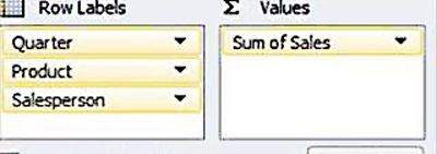
Now, suppose we rearrange the data on the Pivot Table by shifting the row headers around as follows:


We are trying to evaluate each salesperson’s performance on each product over time. The numbers on the Pivot Table don’t provide much clarity. However, the trends become crystal clear immediately when viewing the accompanying Pivot Chart:

Tip of the Day
Whenever possible, add a Pivot Chart to your Pivot Table. Once the chart is set up, rearrange the data in as many ways as possible. You will discover new insights into your data that you never would have by looking only at the numbers. It’s well worth the one additional click it takes to create an accompanying Pivot Chart !
Excel Master Series Blog Directory
Statistical Topics and Articles In Each Topic
- Histograms in Excel
- Bar Chart in Excel
- Combinations & Permutations in Excel
- Normal Distribution in Excel
- Overview of the Normal Distribution
- Normal Distribution’s PDF (Probability Density Function) in Excel 2010 and Excel 2013
- Normal Distribution’s CDF (Cumulative Distribution Function) in Excel 2010 and Excel 2013
- Solving Normal Distribution Problems in Excel 2010 and Excel 2013
- Overview of the Standard Normal Distribution in Excel 2010 and Excel 2013
- An Important Difference Between the t and Normal Distribution Graphs
- The Empirical Rule and Chebyshev’s Theorem in Excel – Calculating How Much Data Is a Certain Distance From the Mean
- Demonstrating the Central Limit Theorem In Excel 2010 and Excel 2013 In An Easy-To-Understand Way
- t-Distribution in Excel
- Binomial Distribution in Excel
- z-Tests in Excel
- Overview of Hypothesis Tests Using the Normal Distribution in Excel 2010 and Excel 2013
- One-Sample z-Test in 4 Steps in Excel 2010 and Excel 2013
- 2-Sample Unpooled z-Test in 4 Steps in Excel 2010 and Excel 2013
- Overview of the Paired (Two-Dependent-Sample) z-Test in 4 Steps in Excel 2010 and Excel 2013
- t-Tests in Excel
- Overview of t-Tests: Hypothesis Tests that Use the t-Distribution
- 1-Sample t-Tests in Excel
- 1-Sample t-Test in 4 Steps in Excel 2010 and Excel 2013
- Excel Normality Testing For the 1-Sample t-Test in Excel 2010 and Excel 2013
- 1-Sample t-Test – Effect Size in Excel 2010 and Excel 2013
- 1-Sample t-Test Power With G*Power Utility
- Wilcoxon Signed-Rank Test in 8 Steps As a 1-Sample t-Test Alternative in Excel 2010 and Excel 2013
- Sign Test As a 1-Sample t-Test Alternative in Excel 2010 and Excel 2013
- 2-Independent-Sample Pooled t-Tests in Excel
- 2-Independent-Sample Pooled t-Test in 4 Steps in Excel 2010 and Excel 2013
- Excel Variance Tests: Levene’s, Brown-Forsythe, and F Test For 2-Sample Pooled t-Test in Excel 2010 and Excel 2013
- Excel Normality Tests Kolmogorov-Smirnov, Anderson-Darling, and Shapiro Wilk Tests For Two-Sample Pooled t-Test
- Two-Independent-Sample Pooled t-Test - All Excel Calculations
- 2- Sample Pooled t-Test – Effect Size in Excel 2010 and Excel 2013
- 2-Sample Pooled t-Test Power With G*Power Utility
- Mann-Whitney U Test in 12 Steps in Excel as 2-Sample Pooled t-Test Nonparametric Alternative in Excel 2010 and Excel 2013
- 2- Sample Pooled t-Test = Single-Factor ANOVA With 2 Sample Groups
- 2-Independent-Sample Unpooled t-Tests in Excel
- 2-Independent-Sample Unpooled t-Test in 4 Steps in Excel 2010 and Excel 2013
- Variance Tests: Levene’s Test, Brown-Forsythe Test, and F-Test in Excel For 2-Sample Unpooled t-Test
- Excel Normality Tests Kolmogorov-Smirnov, Anderson-Darling, and Shapiro-Wilk For 2-Sample Unpooled t-Test
- 2-Sample Unpooled t-Test Excel Calculations, Formulas, and Tools
- Effect Size for a 2-Independent-Sample Unpooled t-Test in Excel 2010 and Excel 2013
- Test Power of a 2-Independent Sample Unpooled t-Test With G-Power Utility
- Paired (2-Sample Dependent) t-Tests in Excel
- Paired t-Test in 4 Steps in Excel 2010 and Excel 2013
- Excel Normality Testing of Paired t-Test Data
- Paired t-Test Excel Calculations, Formulas, and Tools
- Paired t-Test – Effect Size in Excel 2010, and Excel 2013
- Paired t-Test – Test Power With G-Power Utility
- Wilcoxon Signed-Rank Test in 8 Steps As a Paired t-Test Alternative
- Sign Test in Excel As A Paired t-Test Alternative
- Hypothesis Tests of Proportion in Excel
- Hypothesis Tests of Proportion Overview (Hypothesis Testing On Binomial Data)
- 1-Sample Hypothesis Test of Proportion in 4 Steps in Excel 2010 and Excel 2013
- 2-Sample Pooled Hypothesis Test of Proportion in 4 Steps in Excel 2010 and Excel 2013
- How To Build a Much More Useful Split-Tester in Excel Than Google's Website Optimizer
- Chi-Square Independence Tests in Excel
- Chi-Square Goodness-Of-Fit Tests in Excel
- F Tests in Excel
- Correlation in Excel
- Pearson Correlation in Excel
- Spearman Correlation in Excel
- Confidence Intervals in Excel
- z-Based Confidence Intervals of a Population Mean in 2 Steps in Excel 2010 and Excel 2013
- t-Based Confidence Intervals of a Population Mean in 2 Steps in Excel 2010 and Excel 2013
- Minimum Sample Size to Limit the Size of a Confidence interval of a Population Mean
- Confidence Interval of Population Proportion in 2 Steps in Excel 2010 and Excel 2013
- Min Sample Size of Confidence Interval of Proportion in Excel 2010 and Excel 2013
- Simple Linear Regression in Excel
- Overview of Simple Linear Regression in Excel 2010 and Excel 2013
- Complete Simple Linear Regression Example in 7 Steps in Excel 2010 and Excel 2013
- Residual Evaluation For Simple Regression in 8 Steps in Excel 2010 and Excel 2013
- Residual Normality Tests in Excel – Kolmogorov-Smirnov Test, Anderson-Darling Test, and Shapiro-Wilk Test For Simple Linear Regression
- Evaluation of Simple Regression Output For Excel 2010 and Excel 2013
- All Calculations Performed By the Simple Regression Data Analysis Tool in Excel 2010 and Excel 2013
- Prediction Interval of Simple Regression in Excel 2010 and Excel 2013
- Multiple Linear Regression in Excel
- Basics of Multiple Regression in Excel 2010 and Excel 2013
- Complete Multiple Linear Regression Example in 6 Steps in Excel 2010 and Excel 2013
- Multiple Linear Regression’s Required Residual Assumptions
- Normality Testing of Residuals in Excel 2010 and Excel 2013
- Evaluating the Excel Output of Multiple Regression
- Estimating the Prediction Interval of Multiple Regression in Excel
- Regression - How To Do Conjoint Analysis Using Dummy Variable Regression in Excel
- Logistic Regression in Excel
- Logistic Regression Overview
- Logistic Regression in 6 Steps in Excel 2010 and Excel 2013
- R Square For Logistic Regression Overview
- Excel R Square Tests: Nagelkerke, Cox and Snell, and Log-Linear Ratio in Excel 2010 and Excel 2013
- Likelihood Ratio Is Better Than Wald Statistic To Determine if the Variable Coefficients Are Significant For Excel 2010 and Excel 2013
- Excel Classification Table: Logistic Regression’s Percentage Correct of Predicted Results in Excel 2010 and Excel 2013
- Hosmer- Lemeshow Test in Excel – Logistic Regression Goodness-of-Fit Test in Excel 2010 and Excel 2013
- Single-Factor ANOVA in Excel
- Overview of Single-Factor ANOVA
- Single-Factor ANOVA in 5 Steps in Excel 2010 and Excel 2013
- Shapiro-Wilk Normality Test in Excel For Each Single-Factor ANOVA Sample Group
- Kruskal-Wallis Test Alternative For Single Factor ANOVA in 7 Steps in Excel 2010 and Excel 2013
- Levene’s and Brown-Forsythe Tests in Excel For Single-Factor ANOVA Sample Group Variance Comparison
- Single-Factor ANOVA - All Excel Calculations
- Overview of Post-Hoc Testing For Single-Factor ANOVA
- Tukey-Kramer Post-Hoc Test in Excel For Single-Factor ANOVA
- Games-Howell Post-Hoc Test in Excel For Single-Factor ANOVA
- Overview of Effect Size For Single-Factor ANOVA
- ANOVA Effect Size Calculation Eta Squared in Excel 2010 and Excel 2013
- ANOVA Effect Size Calculation Psi – RMSSE – in Excel 2010 and Excel 2013
- ANOVA Effect Size Calculation Omega Squared in Excel 2010 and Excel 2013
- Power of Single-Factor ANOVA Test Using Free Utility G*Power
- Welch’s ANOVA Test in 8 Steps in Excel Substitute For Single-Factor ANOVA When Sample Variances Are Not Similar
- Brown-Forsythe F-Test in 4 Steps in Excel Substitute For Single-Factor ANOVA When Sample Variances Are Not Similar
- Two-Factor ANOVA With Replication in Excel
- Two-Factor ANOVA With Replication in 5 Steps in Excel 2010 and Excel 2013
- Variance Tests: Levene’s and Brown-Forsythe For 2-Factor ANOVA in Excel 2010 and Excel 2013
- Shapiro-Wilk Normality Test in Excel For 2-Factor ANOVA With Replication
- 2-Factor ANOVA With Replication Effect Size in Excel 2010 and Excel 2013
- Excel Post Hoc Tukey’s HSD Test For 2-Factor ANOVA With Replication
- 2-Factor ANOVA With Replication – Test Power With G-Power Utility
- Scheirer-Ray-Hare Test Alternative For 2-Factor ANOVA With Replication
- Two-Factor ANOVA Without Replication in Excel
- Randomized Block Design ANOVA in Excel
- Repeated-Measures ANOVA in Excel
- Single-Factor Repeated-Measures ANOVA in 4 Steps in Excel 2010 and Excel 2013
- Sphericity Testing in 9 Steps For Repeated Measures ANOVA in Excel 2010 and Excel 2013
- Effect Size For Repeated-Measures ANOVA in Excel 2010 and Excel 2013
- Friedman Test in 3 Steps For Repeated-Measures ANOVA in Excel 2010 and Excel 2013
- ANCOVA in Excel
- Normality Testing in Excel
- Creating a Box Plot in 8 Steps in Excel
- Creating a Normal Probability Plot With Adjustable Confidence Interval Bands in 9 Steps in Excel With Formulas and a Bar Chart
- Chi-Square Goodness-of-Fit Test For Normality in 9 Steps in Excel
- Kolmogorov-Smirnov, Anderson-Darling, and Shapiro-Wilk Normality Tests in Excel
- Nonparametric Testing in Excel
- Mann-Whitney U Test in 12 Steps in Excel
- Wilcoxon Signed-Rank Test in 8 Steps in Excel
- Sign Test in Excel
- Friedman Test in 3 Steps in Excel
- Scheirer-Ray-Hope Test in Excel
- Welch's ANOVA Test in 8 Steps Test in Excel
- Brown-Forsythe F Test in 4 Steps Test in Excel
- Levene's Test and Brown-Forsythe Variance Tests in Excel
- Chi-Square Independence Test in 7 Steps in Excel
- Chi-Square Goodness-of-Fit Tests in Excel
- Chi-Square Population Variance Test in Excel
- Post Hoc Testing in Excel
- Creating Interactive Graphs of Statistical Distributions in Excel
- Interactive Statistical Distribution Graph in Excel 2010 and Excel 2013
- Interactive Graph of the Normal Distribution in Excel 2010 and Excel 2013
- Interactive Graph of the Chi-Square Distribution in Excel 2010 and Excel 2013
- Interactive Graph of the t-Distribution in Excel 2010 and Excel 2013
- Interactive Graph of the t-Distribution’s PDF in Excel 2010 and Excel 2013
- Interactive Graph of the t-Distribution’s CDF in Excel 2010 and Excel 2013
- Interactive Graph of the Binomial Distribution in Excel 2010 and Excel 2013
- Interactive Graph of the Exponential Distribution in Excel 2010 and Excel 2013
- Interactive Graph of the Beta Distribution in Excel 2010 and Excel 2013
- Interactive Graph of the Gamma Distribution in Excel 2010 and Excel 2013
- Interactive Graph of the Poisson Distribution in Excel 2010 and Excel 2013
- Solving Problems With Other Distributions in Excel
- Solving Uniform Distribution Problems in Excel 2010 and Excel 2013
- Solving Multinomial Distribution Problems in Excel 2010 and Excel 2013
- Solving Exponential Distribution Problems in Excel 2010 and Excel 2013
- Solving Beta Distribution Problems in Excel 2010 and Excel 2013
- Solving Gamma Distribution Problems in Excel 2010 and Excel 2013
- Solving Poisson Distribution Problems in Excel 2010 and Excel 2013
- Optimization With Excel Solver
- Maximizing Lead Generation With Excel Solver
- Minimizing Cutting Stock Waste With Excel Solver
- Optimal Investment Selection With Excel Solver
- Minimizing the Total Cost of Shipping From Multiple Points To Multiple Points With Excel Solver
- Knapsack Loading Problem in Excel Solver – Optimizing the Loading of a Limited Compartment
- Optimizing a Bond Portfolio With Excel Solver
- Travelling Salesman Problem in Excel Solver – Finding the Shortest Path To Reach All Customers
- Chi-Square Population Variance Test in Excel
- Analyzing Data With Pivot Tables
- SEO Functions in Excel
- Time Series Analysis in Excel
- VLOOKUP


Aivivu - đại lý chuyên vé máy bay trong nước và quốc tế
ReplyDeletevé máy bay đi Mỹ khứ hồi
giá vé về việt nam
đặt vé máy bay từ đức về việt nam
ve may bay tu nga ve viet nam
ve may bay tu anh ve viet nam
vé máy bay từ pháp về việt nam
khách sạn cách ly ở tphcm
vé máy bay cho chuyên gia nước ngoài
You have a great and interesting blog to visit!
ReplyDelete